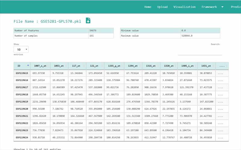
You can only upload files in comma-separated value (.csv) files. The files you upload should be in the following format. We have provided you with a sample file obtained from the NCBI GEO database. It is a dataset containing information about 161 samples with 87 Alzheimer disease patients and 74 normal samples.
01. The first column of the file refers to the unique ID of the samples (In here the number of samples is 161). For example, here the IDs are GSM119615, GSM119616, GSM119617, GSM119618, etc. Note that the sample IDs are used only for naming purposes. Therefore, the sample IDs can be any unique name.
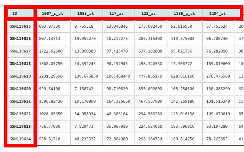
02. The column headers(except the first column) contains the Probe IDs. A probe ID is a unique ID given for a probe/spot in
. For example, here the probe IDs are 1007_s_at, 1053_at, 117_at, etc.03. A row represents the gene expression data values of all the probe IDs with respect to a given sample. This highlighted row represents the gene expression data values for every probe ID in the sample GSM119618.
04. The cells in the highlighted area can only contain numerical values. They contain gene expression values of the samples tested upon different probe_IDs.
05. Important: There are two types of data sets that can be used in GeNet. Apart from the data sets that have to be used in the “Prediction” step, all the other data sets should include their last column named “class”. GeNet supports only binary status for the class label. That is, the samples should either be disease positive or disease negative. The negatives should be represented by 0 while the positive values should be represented by 1. For example, in the given Alzheimer disease-related data set, 1 corresponds to the samples of patients having the disease. 0 corresponds to the control samples. Note that this column should be named as ‘class’ all in simple letters.
For the data sets that can be used in the “Prediction” step, the column containing the “class” label is not necessary. For every other step in GeNet, the data set should include its last column with the binary status.
Annotation table
In your previously uploaded data set, the gene expression values correspond to probe_IDs. Multiple probe_IDs can map to the same gene. Also, a probe/spot may contain information about multiple genes. Genes are identified by their gene symbol or gene ID. Annotation tables are tables that contain data about the probe_IDs and their respective gene symbols. If you want to proceed with gene symbols and get your final results in terms of genes, you have to map the probe_IDs to their gene symbols. When uploading the custom annotation tables, it should be in the following format.
Probe Selection methods
When mapping the probe_IDs to gene symbols there are some instances where we get the same gene symbol at multiple times. However, to proceed further in the analysis we should only have a single set of values per gene symbol. There are multiple ways that you can perform to handle this issue.
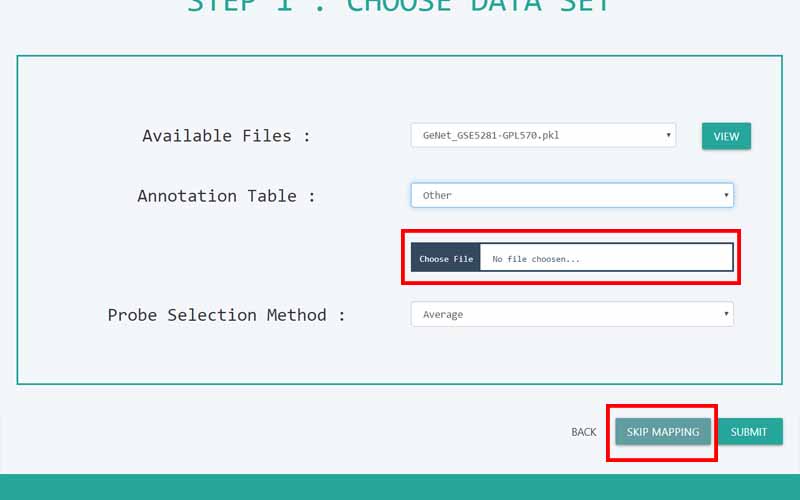
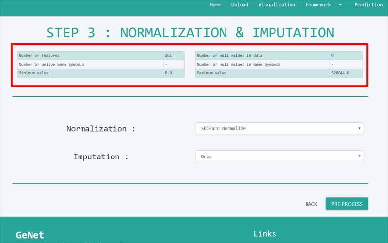
If you proceed with mapping the probe_IDs to gene symbols, the next page will show the details of the table with your data set just before being mapped to the gene symbols. The table at the top of the page shows a brief summary of the data set you input. The number of features refers to the number of attributes in the data set, in this case, which will be the number of total probe_IDs. The maximum and minimum values show the maximum and minimum gene expression data values present in the corresponding data set.
On this page, the table at the top shows the details of the table with your data set after being mapped to the gene symbols. We have earlier selected a method for Probe Selection (average, min, max, interquartile range). The “number of unique gene symbols” refers to the total number of gene symbols we end up with after this probe selection method is performed. When mapping the probe_IDs to gene symbols from the annotation table, there are some probe_IDs that do not map to any gene symbol at all. This number is represented by the “number of null values in gene symbols”. There can be some missing values for gene expression data in the data set. “Number of null values of data” refers to this missing value instances. The maximum and minimum values show the maximum and minimum gene expression data values present in the corresponding data set after going through the selected method in the probe selection method.
The data set still contains raw gene expression data. Raw gene expression data from these high-throughput technologies must be normalized to remove technical variation so that meaningful biological comparisons can be made. Data normalization is a crucial step in the gene expression analysis as it ensures the validity of its downstream analyses. Normalization is the process of scaling individual samples to have unit norm. In basic terms, you need to normalize data when the algorithm predicts based on the weighted relationships formed between data points. The goal of normalization is to change the values of numeric columns in the dataset to a common scale, without distorting differences in the ranges of values.
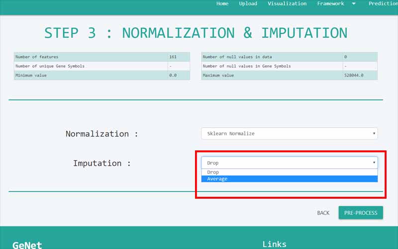
The data set might also contain missing values. These missing values may sometimes skew the results if not handled properly. Missing data presents various problems. First, the absence of data reduces statistical power, which refers to the probability that the test will reject the null hypothesis when it is false. Second, the lost data can cause bias in the estimation of parameters. Third, it can reduce the representativeness of the samples. Fourth, it may complicate the analysis of the study.
One of the simplest methods to reduce the impact of missing values is to drop the complete sample including the missing values so that it won’t skew the results. However, when the sample size is small, this might not be a good approach. Instead of dropping the whole sample, you can replace the missing value with the average of present values which will be a fair indicator of the missing values.
This page shows the data set after being mapped to gene symbols, normalization steps and missing values handling. “Number of features” refers to the number of unique gene symbols. Minimum and maximum values show the current minimum and maximum values for gene expression data that have been undergone trough normalization and imputation methods.
Microarray studies often aim to identify genes that are differentially regulated across different classes of samples; examples are: finding the genes affected by treatment or finding marker genes that discriminate diseased from healthy subjects. Since the data set contains a column named ‘class’ with binary values, we can identify differentially expressed genes across those two samples by performing statistical tests.
Comparing two conditions
A simple microarray experiment may be carried out to detect the differences in expression between two conditions. Each condition may be represented by one or more RNA samples. Using two-color cDNA microarrays, samples can be compared directly on the same microarray or indirectly by hybridizing each sample with a common reference sample. The null hypothesis being tested is that there is no difference in expression between the conditions; when conditions are compared directly, this implies that the true ratio between the expression of each gene in the two samples should be one. When samples are compared indirectly, the ratios between the test sample and the reference sample should not differ between the two conditions.
'Fold' change
The simplest method for identifying differentially expressed genes is to evaluate the log-ratio between two conditions (or the average of ratios when there are replicates) and consider all genes that differ by more than an arbitrary cut-off value to be differentially expressed. For example, if the cut-off value is chosen is a two-fold difference, genes are taken to be differentially expressed if the expression under one condition is over two-fold greater or less than that under the other condition.
P-Value
In statistics, the p-value is the probability of obtaining results as extreme as the observed results of a statistical hypothesis test, assuming that the null hypothesis is correct. The p-value is used as an alternative to rejection points to provide the smallest level of significance at which the null hypothesis would be rejected. A smaller p-value means that there is stronger evidence in favor of the alternative hypothesis. P-value is calculated through the t-test in GeNet.
The t-test
The t-test is a simple, statistically based method for detecting differentially expressed genes. In replicated experiments, the error variance can be estimated for each gene from the log ratios, and a standard t-test can be conducted for each gene; the resulting t statistic can be used to determine which genes are significantly differentially expressed.
Volcano Plot
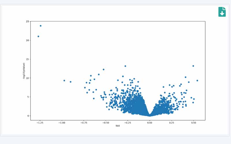
The 'volcano plot' is an effective and easy-to-interpret graph that summarizes both fold-change and t-test criteria. It is a scatter-plot of the negative log10-transformed p-values from the t-test against the log2 fold change. Genes with statistically significant differential expression according to the gene-specific t-test will lie above a horizontal threshold line. Genes with large fold-change values will lie outside a pair of vertical threshold lines. The significant genes will tend to be located in the upper left or upper right parts of the plot.
More often the purpose of microarray gene expression analysis is to output a set of genes that have a significant impact on a particular factor. For example, if the “class” label of the data set contains information of samples of patients with breast cancer and without breast cancer, genes that could have been a biomarker for that disease could be revealed through the proper analysis. For that GeNet has a framework that selects the most dominant set of genes through multiple steps.
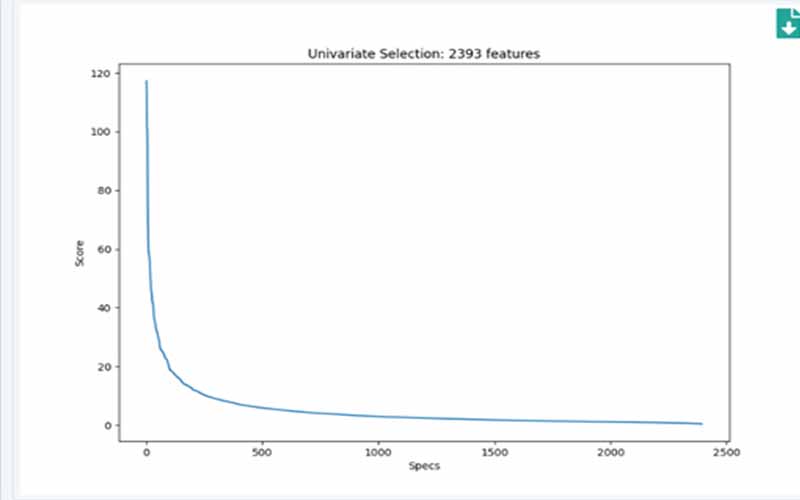
As the first step in the framework, GeNet uses univariate selection values. Univariate feature selection works by selecting the best features based on univariate statistical tests. The scores are calculated using scikit learns’
The graph shows the scores of genes based on their importance for a particular target. The y-axis of the graph shows the number of genes. By observing this graph, you can get an idea of the number of genes showing the highest scores. You can see that after the bending point of the graph, the variation of scores is not changing much. That implies that those genes do not have a high impact on the target variable. To minimize the number of features, you can only select the number of genes appearing before the bending point of the graph.
The performance of classifiers differs from each data set. Therefore, to proceed further, we select the best 3 classifiers showing the best results out of the 6 classifiers. “Selected Classifiers” refers to these selected methods. They will be used in the next steps of the framework.
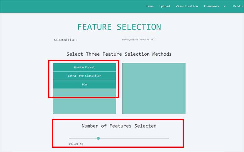
After reducing the gene list to a considerable smaller factor, the accuracy could be still developed if you could further narrow down the gene list and select only the few sets of genes that have a very significant impact on the target variable. For that, we make use of feature selection methods. We use 3 feature selection methods that will select the best n number of genes according to their algorithms. You can select the number n by using the scroll bar at the bottom of the page.
Principal Component Analysis (PCA)
Is a technique that uses an orthogonal transformation to convert a set of observations from correlated features into a set of linearly uncorrelated variables called principal components. GeNet selects n genes by selecting the highest scored feature in each component.
Random Forest
Random Forest consists of a number of decision trees. Every node in the decision tree is a condition on a single feature, designed to split the dataset into two so that similar response values end up in the same set. The optimal condition is based on a measure called impurity. When training the tree, it can be computed how much each feature decreases the weighted impurity. For forest, the impurity decrease from each feature can be averaged and the features are ranked according to this measure.
Extra Tree Classifier
Feature importance by extra tree classifier implements a meta estimator that fits a number of randomized extra trees on various sub-samples of the dataset and uses averaging to improve predictive accuracy and control over-fitting.
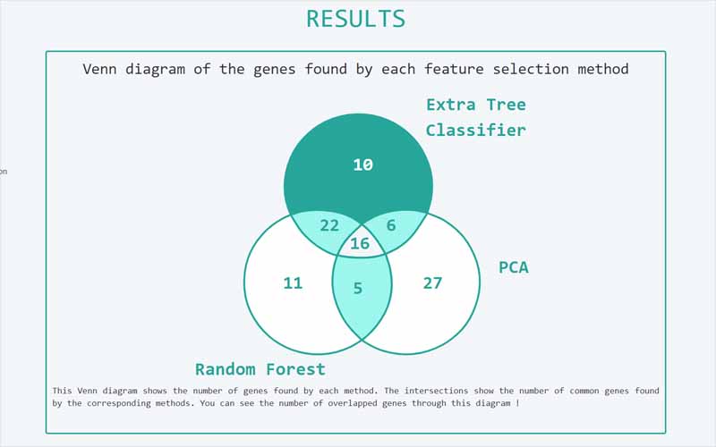
Each 3 feature selection methods will select n number of most prominent genes based on their scores. The Venn diagram shows how these genes found by each method are interrelated. For example, the genes that are found by both PCA and Random Forest will be shown by their intersection. The intersection of all the 3 circles shows the number of genes that are found by all three methods. You can click on these parts to view their gene symbols together with more information. From this point onwards, we will call this set of genes as the “overlapped set” in the next steps of the discussion.
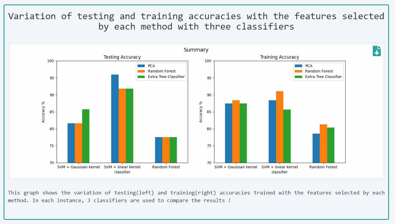
When building our model, we split the data set into 2 parts called testing and training data set. We applied k- fold
This page shows in detail the nature of the gene list we obtained by the feature selection methods. Here, we will discuss step by step how we obtain the final set of the gene list. Usually, the genes are co-regulated and hence the genes we obtained might be highly correlated. The problem with getting a higher number of correlated genes is that they might cause redundancy. Having redundant data in the final result may not provide novel information. Therefore, GeNet built its framework to identify the genes that are not redundant and provide the highest accuracy at the same time.
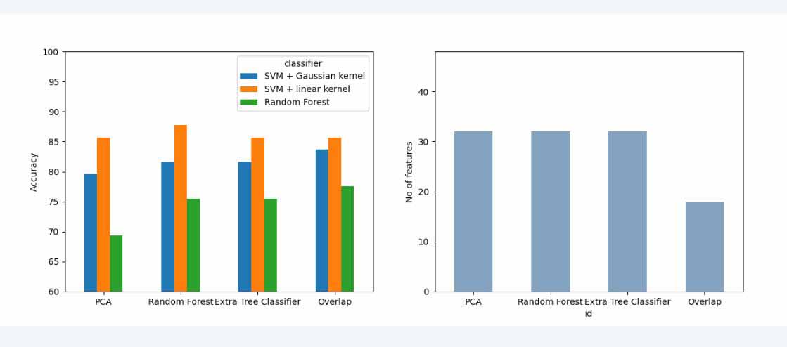
In the first set of graphs, the graph at the right shows the number of genes selected by each feature selection method excluding the overlapped gene set. The last column refers to the number of “Overlapped” set of genes, that is the genes that are found by all the three methods. The graph at the left shows how the accuracy of the models varies when you only input the gene list selected by each feature selection method excluding the overlapped set. Here also, we use the same 3 classifiers we used earlier to get the accuracy.
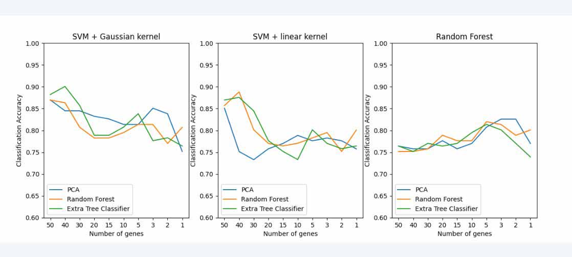
In the second graph, GeNet shows how the accuracy varies when you gradually keep on decreasing the number of genes. For example, if the selected number of features by each method is 50, you can get the best 50, 40,30,20,10,5,3,2,1 set of genes by gradually decreasing the number of features. By plotting the accuracy for these subsets of genes, you can see how the accuracy varies according to the number of features you select. Here also, you can compare and contrast the results using 3 classifiers.
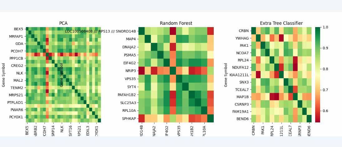
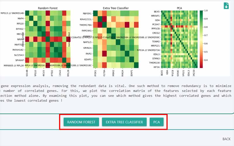
The third section of this page shows the set of the correlation matrix. We plot these, to identify the highly correlated genes. Here, we plot the correlation matrix for the genes that are selected by one method , for example, if we have selected the best 50 genes by all the 3 feature selection methods and 10 genes out of these can be found in the overlapped set, we have plotted the correlation matrix for those 40 (50-10) genes. Likewise, we have repeated the same for the genes found by the other 2 feature selection methods as well.
Correlation matrix
A correlation matrix is a table showing correlation coefficients between sets of variables. Each random variable (Xi) in the table is correlated with each of the other values in the table (Xj). This allows you to see which pairs have the highest correlation. The color code bar at the right corner of the correlation plots shows how the color variation can be interpreted through the plot. The highest correlation occurs between the same two pairs of genes and corresponds to a correlation coefficient of 1. It is denoted by dark green while the lowest correlation coefficients are represented by dark red. If there’s a dark red unit in the plot, that means that those two particular genes are less correlated.
In the final gene list, we would have the “overlapped” set of genes together with another set that is extracted by considering correlation coefficients. The latter can be obtained by choosing a gene list out of the 3 gene lists. The 3 gene lists are the genes that are extracted by each feature selection method alone. For example if the 3 methods used in feature selection are PCA, random forest and extra tree classifier, you have 3 gene lists.
You can choose which data set you want to proceed with by selecting one out of the above 3 lists. Usually, to reduce redundancy, it is recommended to use the gene list with the least correlation, which is the plot with the highest color variation.
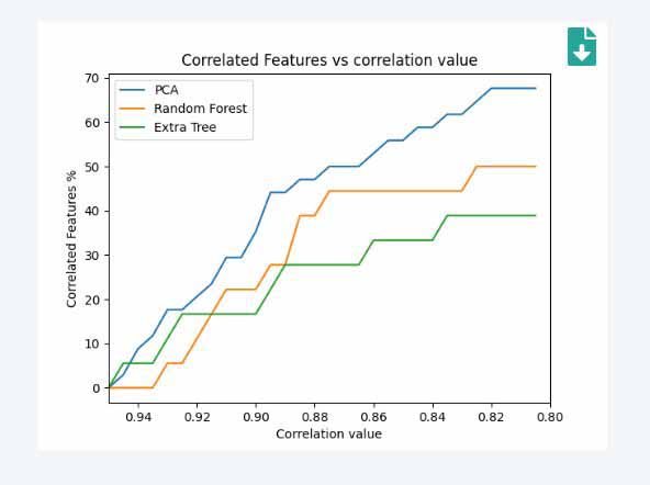
This page discusses in detail the results according to your choice in the previous step. The first graph shows how the number of correlated features varies with the correlation coefficients. If we consider a point p(x,y)in the graph, x denotes the correlation coefficients. The y represents the number of features as a percentage that have a correlation coefficient within the range of (1 to x). The higher the y value with regard to a constant point in x, the higher the correlated genes are. Our motive should be to choose the gene set with the least correlation. You can decide whether your decision to select the specified gene list in the earlier step was correct or not from this. If you want to change the method, you can go back and select the new gene list you want to proceed with.
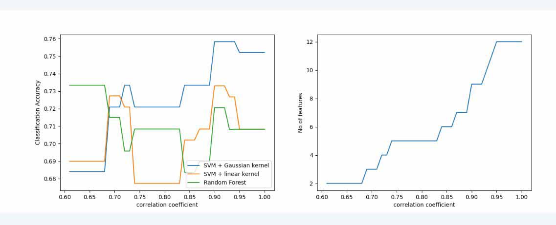
The second section of graphs shows the variation of classification accuracies with the number of genes with respect to their correlation coefficients. The graph at the right shows the number of features in the range of correlation coefficients from range 0 to x correlation coefficient. The graph at the right shows how the classification accuracy change when we only train it by selecting the gene list that is within the range of correlation coefficient. Here also, it is trained with 3 classifiers. The result in this graph(left) is further interpreted in the table below.
Here, the points that get the highest accuracy from each classifier is selected. The first column shows the correlation coefficient at that point. The second column shows the total number of features that lie within 0 and that particular correlation coefficient. The third column shows the classification accuracy at the point. Out of the 3 classifiers, the feature list with the highest accuracy is obtained. This is the other gene list that forms the final result together with the previously obtained “overlapped” set of genes. Finally, the extracted gene list from the raw data set is shown. It consists of
Now we have got our final results. This page further discusses it’s performance. The first section deals with the gene list found by considering the correlation values. The graph at right shows the correlation matrix of the features selected by that method. The graph at left is the receiver operating characteristic curve or ROC curve. It is a graphical plot that illustrates the diagnostic ability of a binary classifier system as its discrimination threshold is varied. A ROC curve is constructed by plotting the true positive rate (TPR) against the false positive rate (FPR). The true positive rate is the proportion of observations that were correctly predicted to be positive out of all positive observations (TP/(TP + FN)). Similarly, the false positive rate is the proportion of observations that are incorrectly predicted to be positive out of all negative observations (FP/(TN + FP)). The ROC curve shows the trade-off between sensitivity (or TPR) and specificity (1 – FPR). Classifiers that give curves closer to the top-left corner indicate better performance. The closer the curve comes to the 45-degree diagonal of the ROC space, the less accurate the test.
In the table, it shows the training and testing accuracies. We first split the data set into two parts and the data is trained with the training test. After the training is done, the test data set is used to test the accuracy too as it is completely independent of the training process.
The second section shows the above same procedure for the total set of genes. That is the genes selected by considering correlation coefficients as well as the overlapped set of genes. The ROC curve considering the total gene is shown on the left side. The correlation matrix considering total genes is shown in the left side to see the correlation of genes found by both methods.
Now, you have obtained the best biomarker genes for a particular target variable (samples with Alzheimer’s disease or not, samples with breast cancer or not etc). We have used machine learning and statistical methods and have chosen the best method mathematically. However, it’s better if we can validate the biological relevance of our result. For that, we use data in
GeNet compares your final set of genes with the gene list provided by the GeneCards. GeneCards contain data about the genes that are already biologically validated by means of other experiments. Through this, users can get an idea of how relevant their predicted results are.
In the first section, GeNet compares the gene list that you obtained after performing feature selection methods. The Venn diagram shows the interaction between genes selected by different methods and the number of genes selected by each method and their intersections.
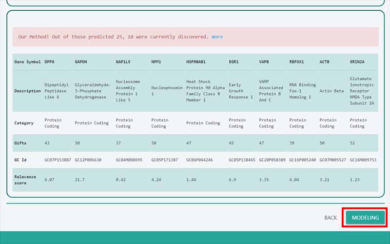
The second section deals with our final set of results (overlapped genes and the genes found by considering correlation). The table shows details of those already identified genes together with a relevance score for the selected disease. Relevance scores are obtained from GeneCards by considering biological literature. The higher the relevance score, the more the gene is expected to have an impact on the disease.
This graph shows the gene regulatory network for the union of genes that are selected by all the three feature selection methods. This can be used to see if there’s any interaction between the finally extracted genes and the previously selected genes by the feature selection methods. The nodes in the red colour show the final set of genes that were selected using the overlapped set of genes and by considering correlation values. The genes that are not extracted in the final result are shown in green colour.
Now, we have obtained a set of genes list which we believe to be of high performance. We can use these results as an input to a different data set and predict their target variable if their “class” label is not already known. The process of modeling means training a machine-learning algorithm to predict the labels from the features. Therefore, it is a hypothesis that tries to fit the data and learn to predict the unseen data.
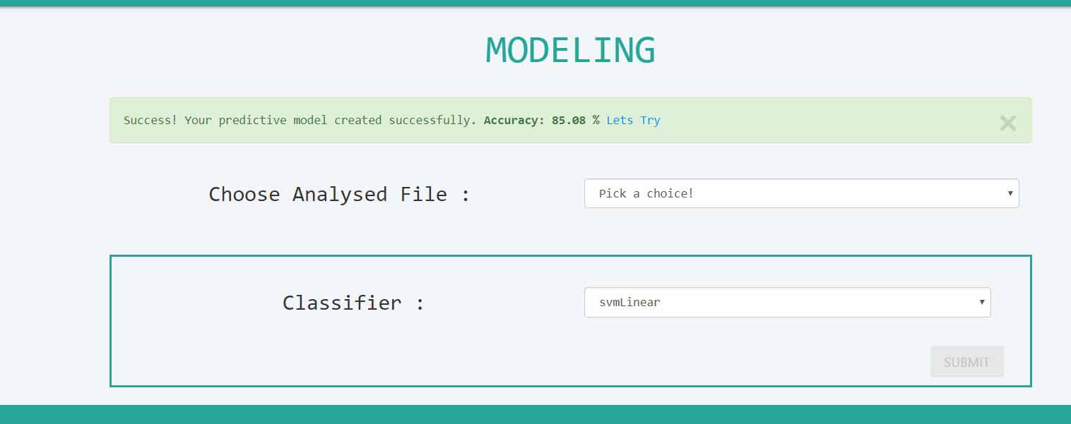
Users can choose the analyzed file and make use of their previously obtained results from the framework and use those data to predict the “class” label of a new data set.
GeNet only deals with binary classification (that is having only two values as the “class” label). It can predict the status of each sample depending on the previous model built. On this page, the table at the left corner gives a brief summary of the model built. The classifier is the algorithm that was used in building the model. The accuracy is the classification accuracy of the developed model.
This visualization tool is designed for users to quickly grasp the patterns of gene expression data. You can choose a given data set and visualize the patterns related to a feature.
The Box plot at the left shows the box plot drawn considering all the samples. The box plot at the right shows to box plots drawn with the samples of each class only. For example, if one class is about the positive samples and the other class should contain only the data about negative samples.
GeNet provides the facility to construct a gene network based on the graphical lasso method of the